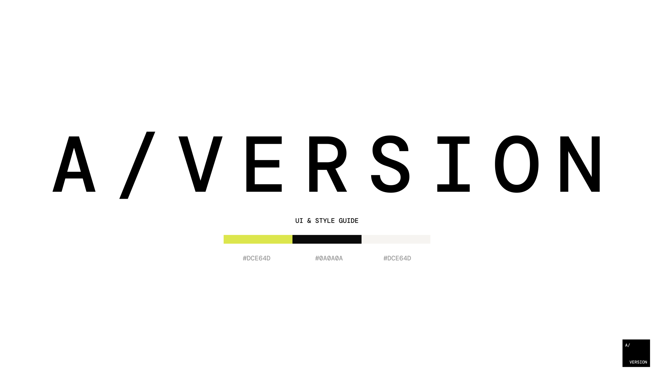
A/VERSION Identity and Website
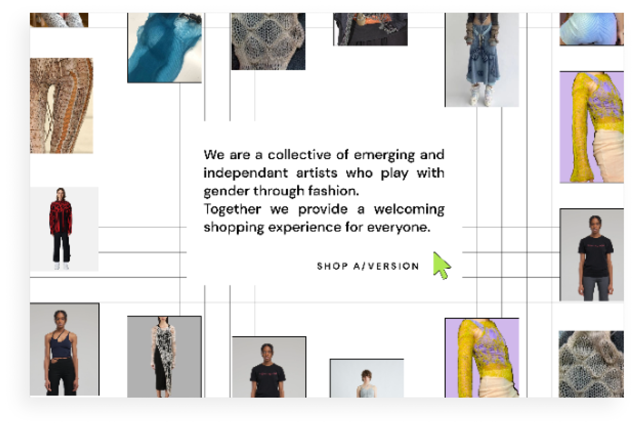
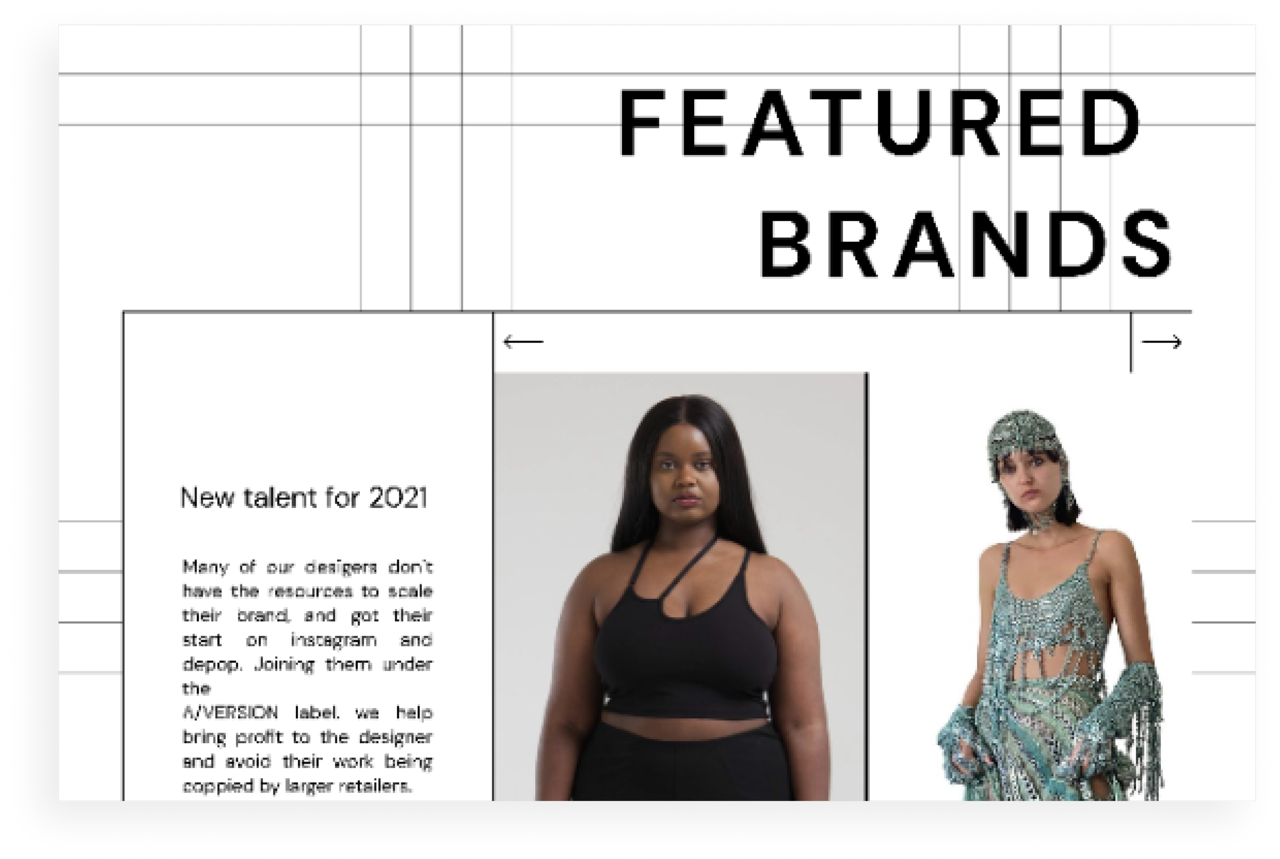
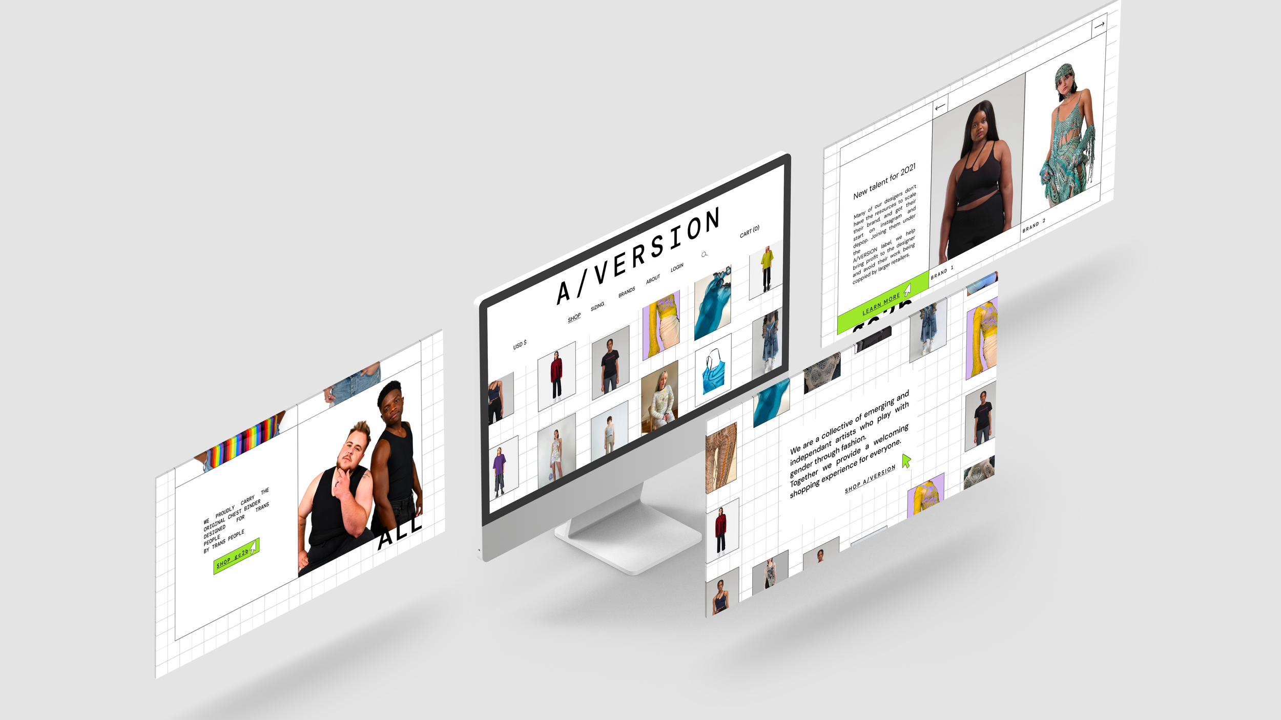
A/VERSION is a fashion and arts concept store focusing on uplifting independent designers and creating an inclusive shopping experience for everyone. Their business model is two pronged. On one hand they serve as an incubator for up and coming designers, giving them resources, legal help, and a place to sell. On the other hand, they are an e-commerce fashion retailer with a customer niche of young and gender queer shoppers. My goal was to a responsive web design, branding, and UI concept that...
Combines a mixture of small brands under one concept store label.
Accommodates the full spectrum of gender identities and presentations while keeping an intuitive task flow.
Graphic Design | UX & UI Design | March 2021
Process
I followed a human centered design process:
Discovery: Client interviews to best understand the brand needs from all stakeholders; card sorting exercise with10 trans & gender non conforming people as well as 5 cis people.
Translation > Built personas and collected inclusive design patterns to present to client and create alignment with project road map
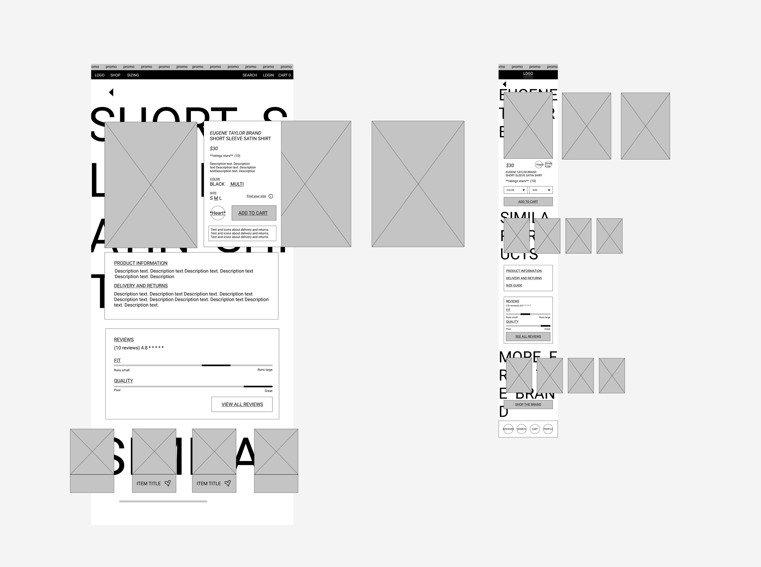
Wire frames > Low fidelity frames
Usability Test > using wire frames to see if information architecture worked well in mediated usability testing.
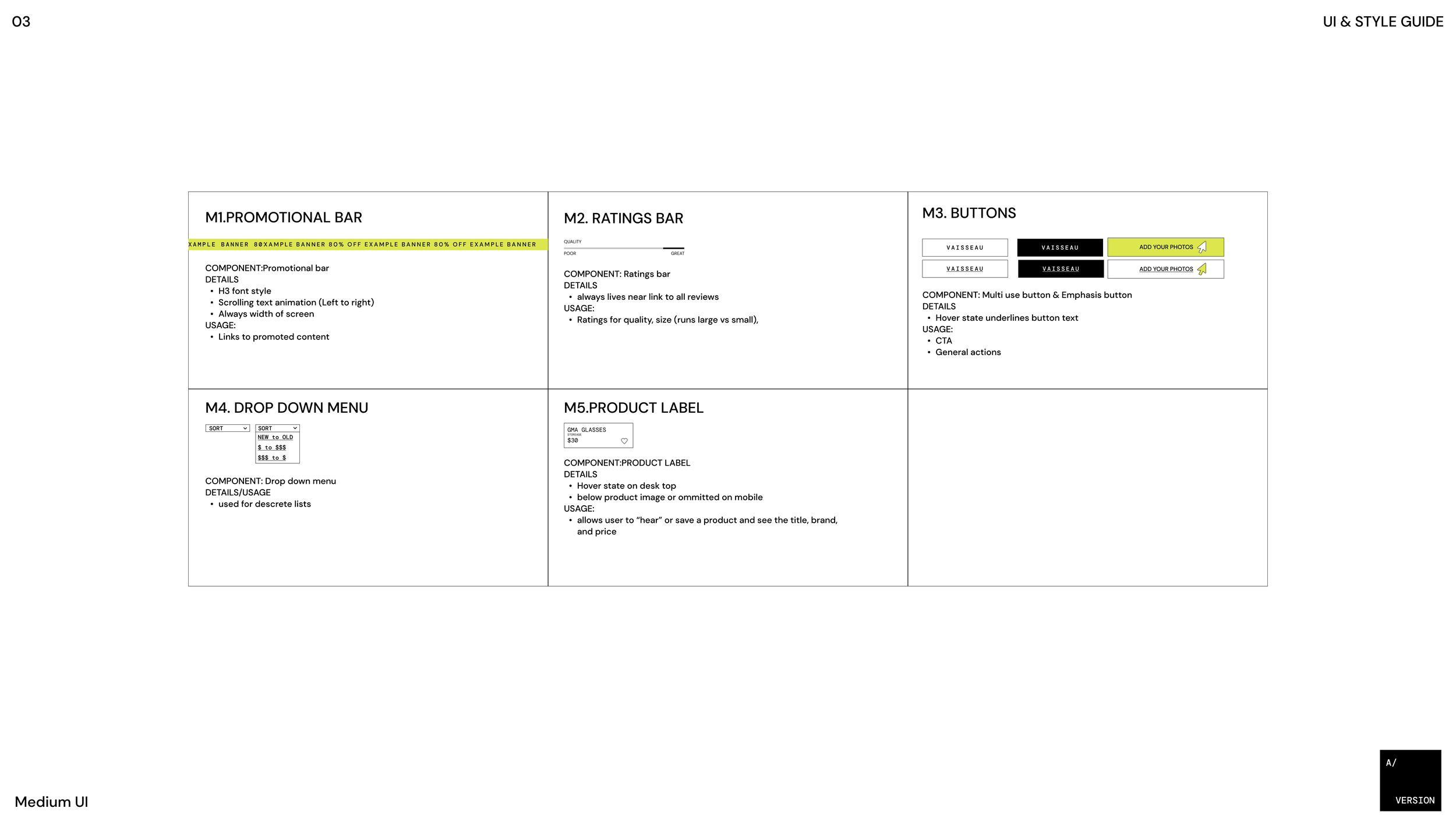
UI Design & Iteration > Created brand style guide and UI kit
Wire frames > High fidelity prototype with UI and branding.
Final Usability Test > Another mediated test with prototype to ensure usability of navigation and effectiveness of branding
Challenges & Conclusions
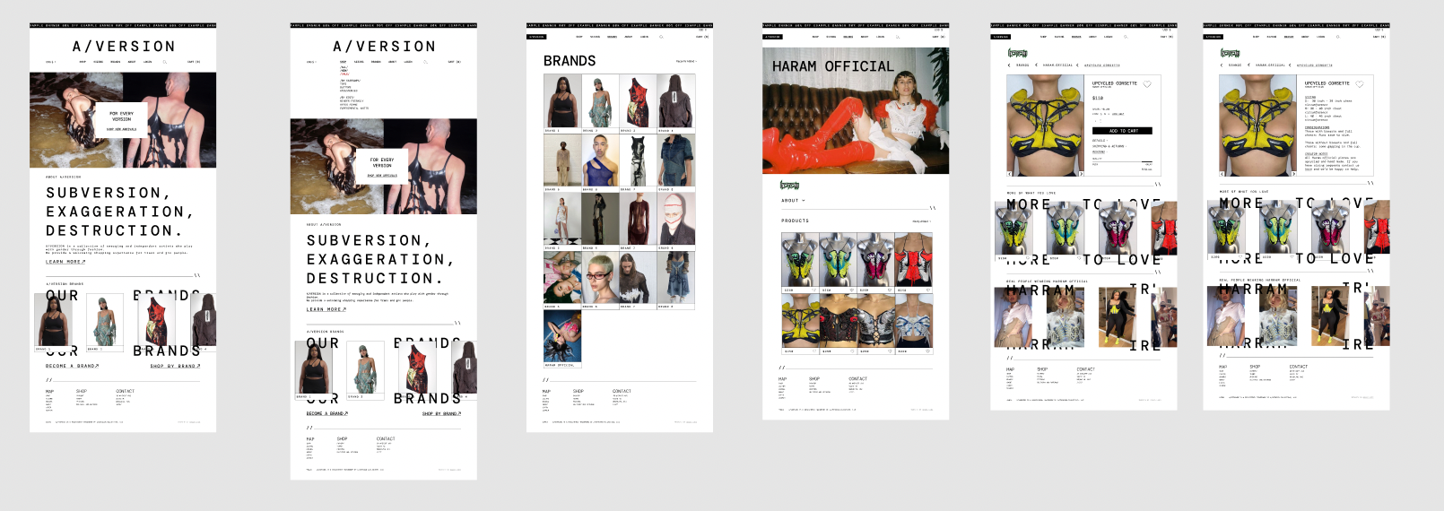
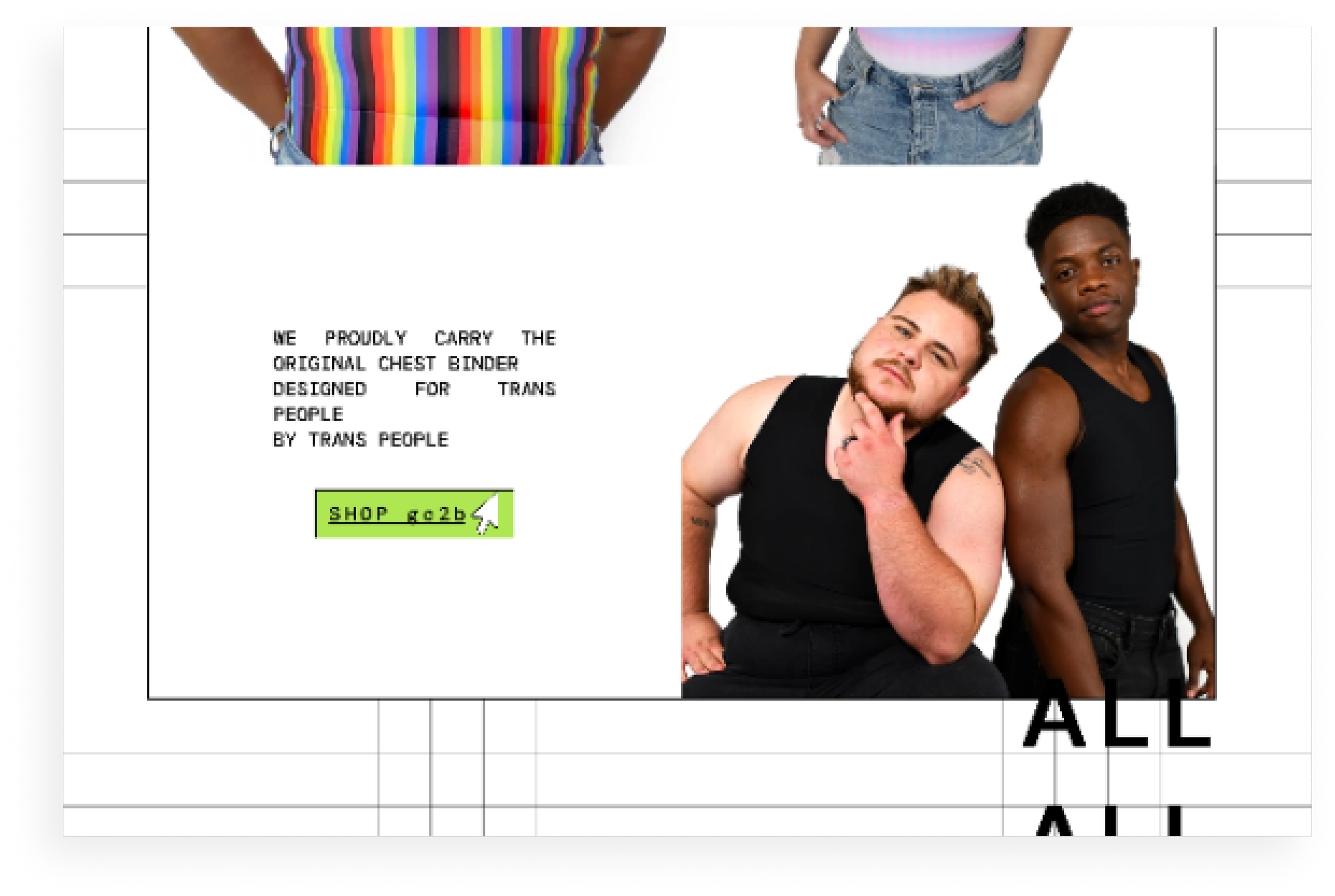
The key challenge of this project was reworking antiquated fashion e-commerce design patterns for trans people, while maintaining usability. In the end I settled on a design that allows for extensive reviews from previous shoppers, and a navigation system that allows the client to customize collections alongside a traditional menu. During user interviews we identified the main clothing shopping challenges that the group of shoppers face. Certain elements like room in the chest, or room in the crotch, waist creating silhouettes, and cuts that hide a binder were all concerns. We collected this information then decided on some structured collections to showcase in the main menu.
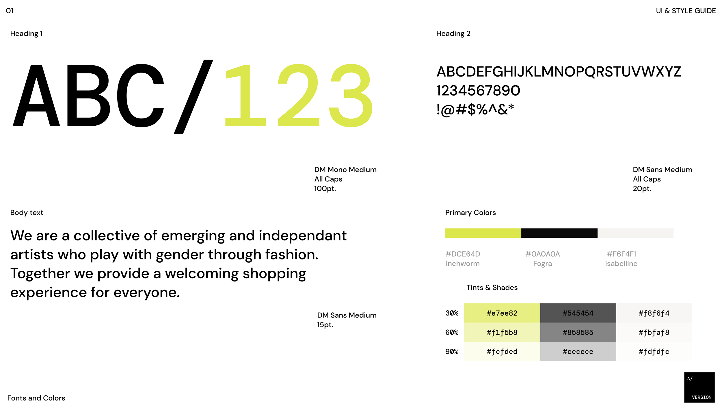
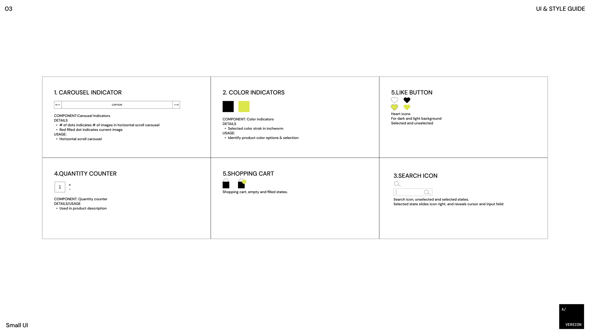
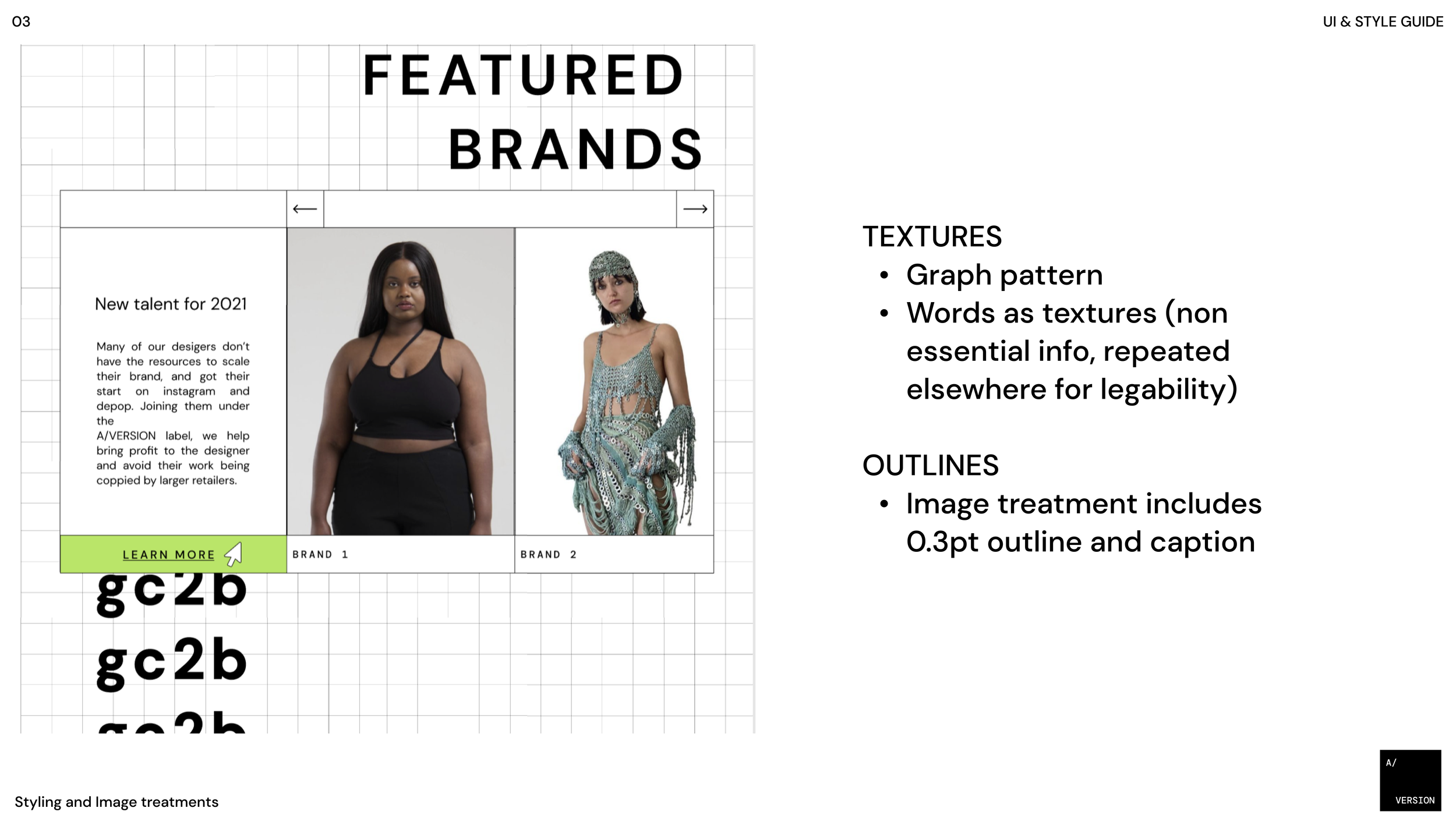
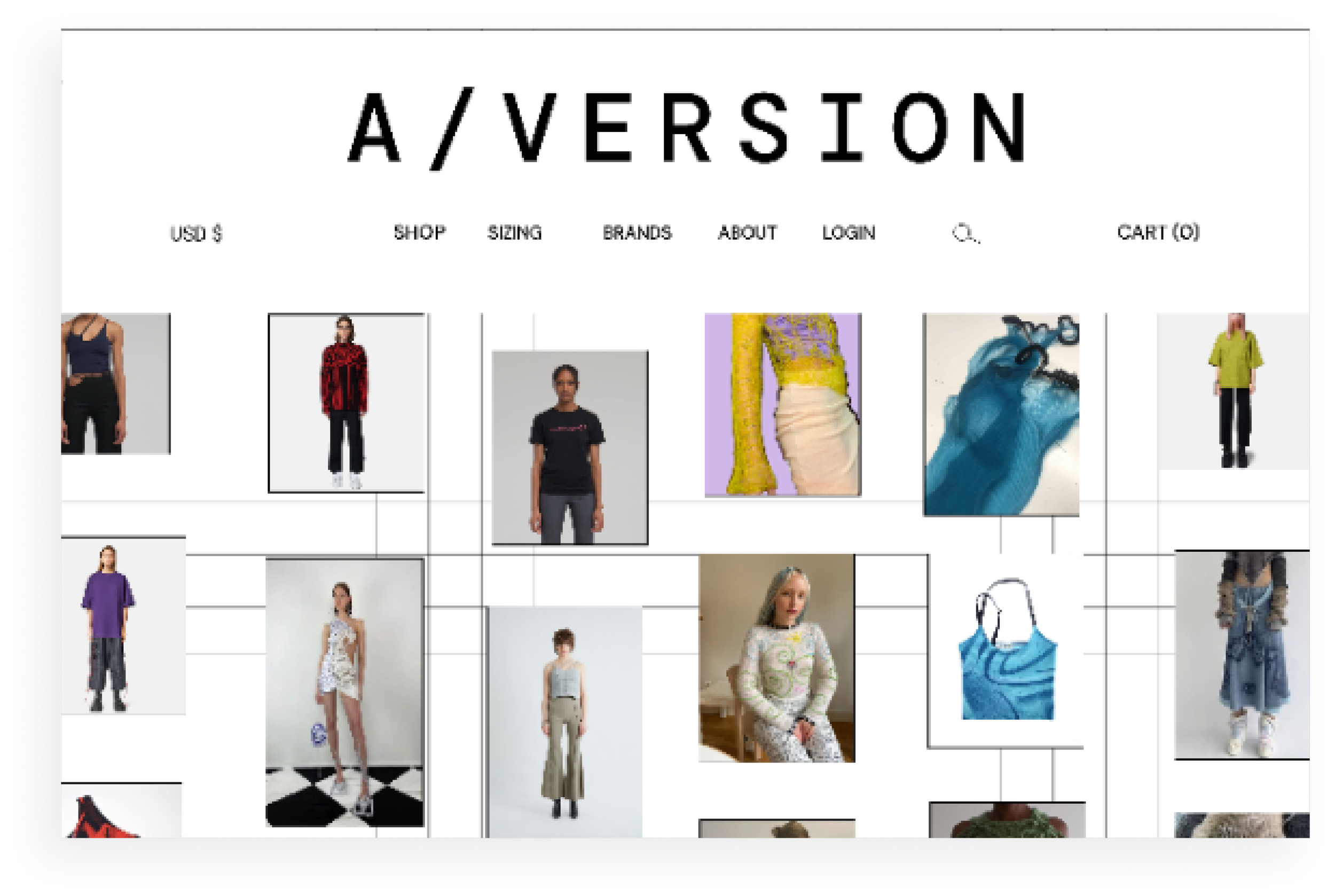
The UI and style guide are done in a brutalist style that allows implies the refreshing attitude of the brand, and highlights the designers work. Find stills of the final site design and style guide below.